Wednesday, 7 April 2010

Zoya Flash Swatches

Hello my Sweet Nail-Art Lovers.
Today i am posting a swatches of new summer 2010 collection by Zoya - "Flash", that was kindly sent to me by Art of Beauty for review.
From the first glance the whole collection is an eye catching blast of color and joy.
All the colors are so alluring and beautiful, but i wold not say that any of those are truly unique. I found a close match for almost all the colors from this collection in the polishes that i own - and i don't even own that many. However it is good to have it all packed together in a Flash collection with the exceptional quality of Zoya polishes.
It does not look like this in the bottle, but i d say that Flash polishes are more on the sheer side - which means most of it will work awesome for nail-art and especially gradients.
My pictures turned out not really great. Lacquers from this collection acts like a neons when it comes to taking pictures, they are super bright and don't look like in real life. But unlike neons it does not fry mate, but glossy creamy and gorgeous.
Jancyn
Maura
Jolene
Dana
Perrie
Robin

Just a random Zoya bottle upgrade :D

Nfu Oh, Queen of Holos, #65

Nfu Oh 65
Nfu Oh 65
Nfu Oh 65

Hi everyone! I hope everyone's doing fine! Since I've been showing you some subtle holos lately, I decided to show you this blingtastic one: Nfu Oh's number 65. Nfu Oh holographic nail polishes are really something else, I have yet to find a holo that's louder, bolder and more in your face than the ones by Nfu Oh. Eventhough I prefer my holos to be more scattered, subtle, I do love this extravagancy every now and then.

When I wear this, there's no way I can stop looking at it. And apparently, I'm not the only one: on my way to work this guy stopped me to look at my nails haha! 65 is a light blue dense holo, with a powdery finish. Application is a bit weird, very smooth but also very patchy, it took me 3 coats to cover up any bald spots. These holos are still quite holo in regular lighting, how cool is that!?

What do you think of holos like these? Too much or is there no such thing when it comes to holos?

Thanks so much for reading, take care!
-Michèle

FOLLOW UP: This polish has pretty bad wear, after two days it was chipped all over.

MONEY MONEY MONEY

So this client came in with a bunch of money which is always fabulous! Ha ha! I have seen money in nails before but wanted it to be practical and functional for my client. The green glitter is from sparklesnailproducts.com. I painted the $ with my migi nail art pen.

This is also a glitter from sparklesnailproducts.com. The neon colors are from artglitter.com. I mixed them with acrylic myself. Too cute!

These are fimo clay dragonflies. I always love purple nails!

From Dusk To Dawn

Ben je al die Catrice lakjes al zat? Jammer dan want er zijn er nog veel meer!
Are you getting tired of all these Catrices yet? Too bad because there are a lot more!


Dit is From Dusk To Dawn, een erg mooie taupe die precies tussen Sephora by OPI Metro Chic en China Glaze Channelesque ligt. Een beetje paarser dan Channelesque, een beetje minder dan Metro Chic. Ze hebben wel bijna dezelfde kleurdiepte. (Ik zal later een vergelijking doen waar ook Catrice Lost In Mud bij zal zitten)

This is From Dusk To Dawn, a very nice taupe that is right in the middle of Sephora by OPI Metro Chic and China Glaze Channelesque. A bit less purple compared to Channelesque, a bit more than Metro Chic. The colour depth is pretty much the same. (I'll do a comparison later that also includes Catrice Lost in Mud)


Ik houd van modderige kleuren! Iemand zei vandaag tegen me dat deze niet erg lente-achtig was. Ik vind taupe gewoon een pastel bruin en niets is meer geschikt voor de lente dan pastels, dus. *steekt tong uit*

I looooove muddy colours! Someone commented on my nails today saying it wasn't very appropriate for spring. I say taupe is like a pastel brown and nothing screams spring more than pastels, so there. *sticks out tongue*


Ik heb volgens mijn statistieken vandaag ineens heel veel bezoekers via www.forum.hr. Welkom! Kan iemand het directe linkje aan me geven van de post op dat forum? Ik vind het altijd wel leuk om te zien waar mijn bezoekers vandaan komen. Bedankt!

My statistics tell me I have a lot of visitors from www.forum.hr today. Welcome! Can someone post a direct link to the post on that forum? I always like to see where my visitors come from. Thanks!

That's Your Cue!


Hey!! Today's manicure definitely has some balls. (Billiard balls, that is) :-D I love playing pool, though I never seem to get to these days. I used to play a lot more when I was in college and in my early 20s, and was somewhat of a shark. :) Alas, my sharkin' days are over, and I am but a pool guppy now. I need to find a place and people here in Vegas to play a few games with! Any takers? :-)


right hand (messy!! lol)


I used American Apparel Hassid for the thumb, Electric Orange for the index finger, Pure Ice French Kiss for the middle finger, Green Scene for the ring finger, and American Apparel Manila for the pinky. I used American Apparel Hassid and American Apparel Cotton on all fingers for the while of the ball and for the numbers. :) Topped it all off with 2 coats of Seche Vite top coat. :)

I think I need to play a good ol'-fashioned game of 9-ball I think... I'll settle for 8-ball though.

Tuesday, 6 April 2010

Coral Comparison featuring OPI, Essence, P2 & Catrice

Essence What do U think?, Catrice I Scream Peach!, P2 Flamboyant and OPI Shootout at the O.K. Coral

Hi guys! After swatching Catrice's I Scream Peach! the other day, I really felt like doing a comparison! I picked out four colors to compare: Essence - What do U think?, Catrice - I Scream Peach!, P2 - Flamboyant and OPI - Shootout at the O.K. Coral. As you can see, these are somewhat similar in the bottle.

Essence What do U think?, Catrice I Scream Peach!, P2 Flamboyant and OPI Shootout at the O.K. Coral

On the nail, they are quite different, well two of them are. What do U think and I Scream Peach! are almost identical, I think the latter is a teeny tiny bit darker. Like I mentioned, these are really close dupes of Chanel's Orange Fizz!
The formula of these are really similar too, they're both cremes and they both need 3 coats. The one by Essence is more smooth when it comes to application.

P2 Flamboyant is darker and more vibrant, a bolder color. The finish of this one is kinda where a creme and a jelly meet. It took me 4 coats to get rid of the evil VNL, but other than that, application was perfectly fine.

OPI's Shootout at the O.K. is really different from the others, it is slightly duochrome, alternating between orange and pink. The formula of this one is really good, still needing 3 coats, but applies like a dream.

I think coral is a difficult color though, I love how summer-y it looks, but I do think colors like these tend to look better on someone with a tan, and obviously I don't have one haha. Will you be wearing coral this summer?

Thanks for reading and see you next time!
- Michèle

It Was Elementary, Dear Watson


Today's manicure was inspired by two things, one being a handwritten note on a co-worker's wall from her kid, and the other being the 3 years I spent as a software artist at a children's educational publisher, and all the manuscript writing pages I had to work on. :-D Oh, the memories.... David, Joe, Jordan, Jennifer Neumann *giggle*, Ginger, Dave, and Boz, I miss you guys!!!! :-D Hope all is well at the 'Zone, my friends. :-)


I used American Apparel Cotton as a base, Orly Snowcone for the blue lines, ORLY Pink Chocolate for the pink line, and American Apparel Hassid for the black letters. Topped it off with 2 coats of Seche Vite top coat.

Fun fact about me: I won the Penmanship award in Mrs. Wolthuis' 5th grade class (I think it was 5th, maybe 3rd? I had her twice) :-D Now I have a signature that would make a doctor weep. :-D

Two more things for the ole' SZ buddies...

To David... Cuuuuuuuuuuuuuuuuuuute.

To any other artist.... Did you try making it purple? Drop shadow?

Plum Play With Me!

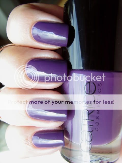
Nog een Catrice uit de nieuwe collectie waarvan je er een aantal kunt winnen bij mijn giveaway. Deze moest ook weer behoorlijk verdunt worden maar verdorie wat ben ik gek op die platte, korte Catrice kwastjes! Ze maken het zo makkelijk om de lak onder controle te houden.
Another Catrice polish from the new collection that you can win some polishes from in my giveaway. This one needed to be thinned considerably too but dang I looooove that flat, short Catrice brush! It makes it so easy to control where the polish goes. 


Plum Play With Me is qua kleur niet echt speciaal maar ik houd wel van een goede paars en ik heb geen exacte dupes in mijn collectie dus ik ben er erg blij mee! In het echt is deze een beetje roder maar helaas pakt deze camera paars niet echt goed op.


Plum Play With Me is not really all that special colour-wise but I love a good purple and I have no exact dupes in my collection so I'm glad I got it! It is a little more red irl but unfortunately this camera won't pick up purples that well.

Holo + Painting

Here are my holo + painting nails.I can not say that it turned out great, but i still decided to post it .Holos are so tricky they are really gorgeous on the sun, but inside i just get super bored of it. This particular holo polish is China Glazee.


Monday, 5 April 2010

Round nails.


Gel nails. Roses and hearts. Tiny polka dots for the lace effect.


Huge pink bows on her thumbs!


Sweet!


Acrylic nails. French tips with pink disco balls inlay! We have the super cute polka dots without having to paint. Hehehe. :D


Orangey and pinkey roses too!