Showing posts with label European Brands. Show all posts

Tuesday, 28 June 2011

Great polishes deserve a name....

... because naming a blog post MNY 549 just looks dumb. Why do nail polish brands do this? It doesn't even have to be a good name. Just name it anything!

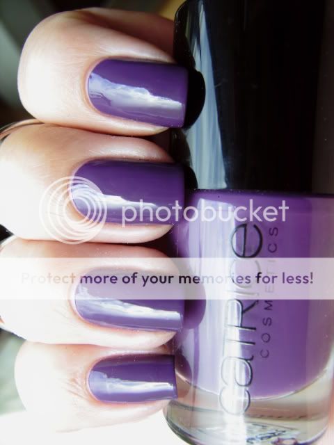
Anyway, here is a polish I picked up a couple of months ago at a DM Drogerie (German drugstore chain) but this brand is also available in the Netherlands at Etos. It's a polish that immediately sparked my interest because I love a good taupe! MNY is a brand that sells affordable make-up in trendy colors for a pretty good price. The polishes cost €2,49.


It's a taupe but with purple undertones which is perfect for me because purple and taupe are my favorite colors. (Closely followed by green and blue) I have one Helmer drawer that is about 3/4 full of taupes and I have no dupes!


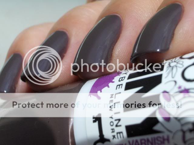
I needed four coats to get it fully opaque but I knew I would be making macro shots and macro is relentless. I think you can get away with three coats in everyday life.

I decided to do a comparison with some close colors:


Pinky: Essence LE You Rock Collection 02 Love, Peace and Purple. Four coats with topcoat.
Ring finger: Rimmel PRO 385 Hot List. Three coats with topcoat.
Middle finger: MNY 549 (See, it looks stupid with no name!) Four coats with topcoat.
index finger: OPI You Don't Know Jacques. Three coats with topcoat.

The Essence and Rimmel polishes are said to be dupes for Chanel Paradoxal. One difference between the two that I noticed irl but couldn't capture on camera is that the Rimmel one has more purple shimmer and a little, almost not noticeable, pearl shine to it which makes it look very glowy and shiny and brings out the purple shimmer more.

OPI YDKJ has more brown and grey and no purple whatsoever.


The base color on both Paradoxal dupes and MNY 549 is the same though so if you like the color but do not like shimmer polishes, this is the polish for you!

It wasn't until I was writing this blog post that I thought I should have also compared it to Models Own Purple Grey so I pulled the bottle out of my Helmer. They are nothing alike. Purple Grey is darker, a lot more purple and isn't as warm toned because it doesn't have brown or taupe in it. If I remember I'll show this to you another time.

So, that's it for today! I'm going to see if I can find some way to cool down because it's been absolutely tropical here. We're supposed to get rain and thunderstorms here tonight and I'm really looking forward to that. Maybe that will cool things down a bit.

Thanks for looking!

xoxo

Thursday, 16 June 2011

Catrice Forget-Me-Not Mattified!

I looooooove this manicure. I bought Forget-Me-Not for the sole purpose of mattifying it and I was right, it looks so good matte!


To see more color accurate pictures of what this polish looks like on it's own, check out these swatches from Witoxicity. For some reason my camera made this one look a lot more blue than it is irl.


Just like we've come to expect from Catrice, this applied like a dream. I love their brush, formula and opacity! I used two coats, 1 coat of Nubar Diamont (old formula) and Catrice Nail Expert Matt Top Coat. Then I used Bundle Monster plate BM02 and China Glaze Millenium for stamping.


I'd like to say I got my blogging groove back but I don't want to jinx it. However, I'm having a lot of fun experimenting with polishes and nail-art over the past few days and it's been great to talk to all of you again!

Thanks for looking and until next time!

xoxo Kirsten

Tuesday, 14 June 2011

Essence Choose Me!

Today I'm wearing Essence Choose Me! This is apparently a dupe for Zoya Charla, OPI Catch Me In Your Net and I belief there's also an Orly polish that is a dupe. I can't compare them for you because I don't own any of those. This is definitely the cheapest of them all though so if you are looking for a budget alternative, you need this in your life!

You've probably seen better pics of this on other blogs but if you haven't I strongly recommend you google this polish. It's a stunning blue-green foil glitter polish that really looks best with a bit of sunshine on it but the sun wouldn't show itself while I was taking pics.


I've seen this polish described as a glitter but I don't agree with that description. It's very sparkly but I would describe this one as a foil. Maybe a foil glitter but not just a glitter.


This is the best pic I could take that shows some of the sparkly goodness. Those of you who own this polishes or one of it's dupes know that it's much better irl but it's impossible to capture without sunlight so this pic will have to do.

Thanks for looking and until next time!

Monday, 13 June 2011

Essence: Right, Girl with Bundle Monster stamp

Hi guys!

It's been a while but I have a manicure I wanted to share with you all. Recently I finally gave in and bought the Bundle Monster plates from www.bundlemonster.com and I'm glad I did! I used an image from plate BM-222 and Wet 'n Wild Black Creme for the design.


Please excuse the tipwear. I'd been wearing this mani for a couple of days before I took the pics.

This polish is from the Essence Multi Dimension line and is called Right, Girl. It's a medium red with red and gold shimmer. The gold shimmer is not very visible on the nail but it's a nice shade anyway.


I don't own many reds (or pinks) but lately I find myself reaching for them more often so I've been expanding my pink and red stash. Do you wear reds and pinks a lot? What are your favorites?

Thanks for looking and until next time!

xoxo Kirsten

Thursday, 20 May 2010

Awesome-sauce!

lol sorry, ik ben gewoon helemaal weg van deze combinatie! Helaas ben ik vergeten om de Eyeko alleen op de foto te zetten maar de kleur spreekt voor zichzelf denk ik. Hoe kan je nou niet van taupe houden?!

lol sorry, I just love this combo! Unfortunately I forgot to take a pic of the Eyeko without the glitter but I think the colour speaks for itself. What's not to love about taupe?!


Dit is drie laagjes Eyeko Posh Polish met een laagje Essence Nail Art Twins Glitter Topper Louise en Nubar Diamont.

This is three coats of Eyeko Posh Polish with one coat of Essence Nail Art Twins Glitter Topper Louise and Nubar Diamont. 


Had ik al gezegd dat ik helemaal weg ben van deze combo? Als er niet een hoekje van mijn duimnagel geknapt was vanmiddag toen ik mijn tas op mijn fiets aan het binden was had ik deze wel een paar dagen gedragen. Ik heb mijn nagels wat korter moeten vijlen om bij de duim te passen maar dat is wel OK. Ik heb een druk weekend voor de boeg en kortere nagels zijn wat praktischer.

Did I mention I love this combo? If I hadn't snapped a corner of my thumb nail this afternoon while strapping my bag on my bike I would have kept this mani on for a couple of days. I had to file my nails a bit shorter to match the thumb but that's OK. I have a busy weekend ahead of me and shorter nails are more practical.

Eyeko Posh Polish is mij toegestuurd voor review door Eyeko.

Eyeko Posh Polish was sent to me for review by Eyeko.

Tuesday, 18 May 2010

Eyeko Jade Green


Direct zonlicht
Direct sunlight

Dit is Eyeko Vintage Polish Jade Green en die is onderdeel van de Eyeko Spring Collection. Oeps, deze is niet uit de lente collectie maar onderdeel van een Limited Edition Collectie. Ik ben gek op deze kleur! Het is waarschijnlijk de eerste mintgroene lak die me geen kreeftenhanden geeft en ik kan er maar niet achter komen waarom niet. Meestal lijken mijn handen heel rood met koele mintgroene tinten maar deze mintgroen is ook koel van kleur met duidelijk blauwe ondertonen en toch heeft deze dat effect niet. Ik denk dat ik mijn perfecte mint-/jadegroene lak gevonden heb!

This is Eyeko Vintage Polish in Jade Green and it is part of the Eyeko Spring Collection. Whoops, this isn't part of the spring collection but it's part of a Limited Edition Collection. I love this colour! It's probably the first mint green that doesn't give me lobster hands and I can't for the life of me figure out why not. Usually the cooler shades of mint green make my hands look really red but this is a mint green that is definitely cool-toned, has strong blue undertones and still doesn't have that effect. I think I may have found my perfect mint/jade green! 

Natuurlijk licht, geen zon
Natural light, no sun

Ik was er zo blij mee dat ik de Konad en de nail-art spullen tevoorschijn heb gehaald. Ik heb gestempeld met Sally Hansen Grape Going en het vlinderpatroon van plate M16. Daarna heb ik een bloemetje met een  duochrome effect toegevoegd. De bloemen weerschijnen groen en blauw als het licht er op valt. Daarna heb ik Nubar Diamont gebruikt om alles mooi te laten glanzen en de bloemen op hun plaats te houden.

I loved it so much I decided to bust out the Konad and the decals. I used Sally Hansen Grape Going for the stamping and used a butterfly patern from plate M16. Then I added flower decals with a nice duochromey accent. The flowers flash green and blue when the light hits them just right. I topped the whole thing off with Nubar Diamont to give it a great shine and to keep the decals in their place.


Deze lak heeft niet de platte kwastjes die ik prettig vind maar ik had geen problemen met aanbrengen. De formule is goed. Ik had drie laagjes nodig om het dekkend te krijgen wat normaal is voor mij, zeker aangezien dit een pastelkleur is. Het enige nadeel dat ik tot nu toe heb ontdekt met dit merk is het formaat van de flesjes. (8.5 ml).


Ik ben op dit moment de inschrijvingen voor mijn winactie aan het tellen en ik hoop vanavond de winnaar aan te kunnen kondigen. Helaas heb ik een aantal inscrijvingen moeten diskwalificeren omdat ze niet aan de regels voldeden. Niet leuk om te doen dus voor mijn volgende winactie ga ik het een stuk simpeler maken. Ik dacht dat de regels nu al niet zo ingewikkeld waren maar blijkbaar heb ik me vergist.Ik wil dat mijn winacties leuk en makkelijk zijn en geen doolhof van opdrachten en regels dus de volgende keer gooi ik alle regels eruit!


This polish doesn't have a flat brush like I prefer but I didn't have any problems with the application. The formula is good. It took three coats to be opaque which is quite common for me, especially considering this is a pastel colour. The only down-side I've discovered with this brand so far is the size of the bottles (8.5 ml). 

I'm counting the entries for my giveaway as we speak so I hope to finally announce the winner by the end of the day. Unfortunately I've had do disqualify some entries because they didn't follow the rules. I don't really like to do that so for my next giveaway I plan to make it a lot easier. I didn't think the rules on this one were so hard to follow but apparently I was wrong. I want my giveaways to be fun and easy and not a maze of tasks, rules and regulations so for the next one I'll get rid of all of them!


Deze lak is me voor review toegestuurd door Eyeko.

This polish was sent to me by Eyeko for review.

Thursday, 6 May 2010

Catrice Limited Edition: The Oceana Collection!

Catrice heeft ons niet alleen een geweldige core line gegeven maar ze blijven ook nog steeds erg mooie (en erg beperkte) limited editions uitbrengen. De meest recente is Oceana.

Niet alle kleuren in deze collectie horen bij het thema vind ik maar wat maakt het uit. Wat wel leuk is, is dat deze collectie twee matte lakjes heeft en dat de kwaliteit erg goed is!

Op naar de swatches.

Catrice did not only bring us an amazing new core line, they also continue to make very nice (very) limited editions. The most recent one is Oceana.

Not all the colours in the collection make sense to me but who cares. What matters is that this collection has two mattes and the quality of the polishes is great!

So, on to the swatches.


Pebble Beach, a zachte lichtgrijs. Dit is mijn favoriet uit deze collectie! De finish is meer satijnachtig dan mat maar dat past bij deze kleur ook wel heel erg goed. Dit is twee laagjes en de dekking was erg goed. De formule was prettig om mee te werken omdat deze niet, in tegenstelling tot sommige andere matte lakjes, haast op het kwastje al droog is.

Pebble Beach, a soft, light grey. This is my favourite from this collection! The finish is more satin than matte but that suits really well with this colour. I used two coats in this pic but the formula was very opaque. It's also easy to work with because, unlike other mattes I've worked with, it doesn't dry before it's properly on your nail.


Sea Of Green. Deze mooie turquoise is ook weer meer satijnachtig dan mat en is een goede tweede favoriet. Mooi! Ook deze was dekkend in twee laagjes en droogde eenmaal op de nagel redelijk snel. Dat is altijd erg prettig aan matte lakken. Bij cremes vind ik een satijnachtige finish ook mooier dan echt mat.

Sea Of Green. This nice turquoise that also dries to a satin finish instead of matte. It's a close second to my favourite. Pretty! This one was also opaque in two coats and once on the nail, it dried pretty fast. I like that about mattes. With cremes I also prefer satin finishes over true matte.


Ik hoor om me heen dat dit een matte versie van I Sea You van Catrice zou zijn maar dat is zoals je ziet niet het geval! Om de vergelijking qua kleur goed te kunnen maken heb ik over beide een topcoat gedaan. Op mijn wijsvinger en ringvinger zit I Sea You en op mijn middelvinger en pink Sea Of Green. Zoals je ziet is Sea Of Green donkerder dan I Sea You.

Word around the blogs is this is a matte version of I Sea You by Catrice but as you can see it is not! To be able to compare the colours correctly I added a topcoat to both of them. I Sea You is on my index and ring finger, Sea Of Green on my middle finger and pinky. As you can see, Sea Of Green is darker compared to I Sea You.


De volgende is Blue Out To Sea. Een donkerblauwe shimmer. Niet heel uniek maar wel mooi. De kobaltblauwe shimmer geeft deze lak net even wat meer diepte.

Next up is Blue Out To Sea. A dark blue shimmer. Not terribly unique but still pretty. The cobalt blue shimmer gives this polish a little more depth. 


De laatste is Ocean Sunset. Ik zal er maar gelijk bij vertellen dat deze foto absoluut niet kleurecht is. Als ik alleen deze wilde laten zien had ik de foto niet geplaatst maar omdat ik de hele collectie laat zien wilde ik hem er toch bij doen. Deze lak is niet oranje maar echt brandweerwagenrood! Een prachtige rode jelly die ook weer niet heel uniek is maar als je nog geen rode jelly hebt dan is dit een erg prettige!
Op de foto draag ik twee laagjes zonder basecoat of topcoat.

Dat was het weer voor vandaag! Bedankt voor het kijken en dat jullie zo geduldig met me zijn geweest toen ik afwezig was.

Last is Ocean Sunset. I'll say straight away that this pic is far from true to colour. If I just wanted to show you this one polish I wouldn't have even posted it but because I'm showing the whole collection I wanted to include it. This polish isn't orange but vibrant fire-engine red! A gorgeous red jelly that also isn't terribly unique but if you don't own a red jelly yet this one is very nice to work with!
I'm wearing two coats without basecoat or topcoat.

And that's it for today! Thank you for watching and for being so patient with me during my absence.

Wednesday, 7 April 2010

From Dusk To Dawn

Ben je al die Catrice lakjes al zat? Jammer dan want er zijn er nog veel meer!
Are you getting tired of all these Catrices yet? Too bad because there are a lot more!


Dit is From Dusk To Dawn, een erg mooie taupe die precies tussen Sephora by OPI Metro Chic en China Glaze Channelesque ligt. Een beetje paarser dan Channelesque, een beetje minder dan Metro Chic. Ze hebben wel bijna dezelfde kleurdiepte. (Ik zal later een vergelijking doen waar ook Catrice Lost In Mud bij zal zitten)

This is From Dusk To Dawn, a very nice taupe that is right in the middle of Sephora by OPI Metro Chic and China Glaze Channelesque. A bit less purple compared to Channelesque, a bit more than Metro Chic. The colour depth is pretty much the same. (I'll do a comparison later that also includes Catrice Lost in Mud)


Ik houd van modderige kleuren! Iemand zei vandaag tegen me dat deze niet erg lente-achtig was. Ik vind taupe gewoon een pastel bruin en niets is meer geschikt voor de lente dan pastels, dus. *steekt tong uit*

I looooove muddy colours! Someone commented on my nails today saying it wasn't very appropriate for spring. I say taupe is like a pastel brown and nothing screams spring more than pastels, so there. *sticks out tongue*


Ik heb volgens mijn statistieken vandaag ineens heel veel bezoekers via www.forum.hr. Welkom! Kan iemand het directe linkje aan me geven van de post op dat forum? Ik vind het altijd wel leuk om te zien waar mijn bezoekers vandaan komen. Bedankt!

My statistics tell me I have a lot of visitors from www.forum.hr today. Welcome! Can someone post a direct link to the post on that forum? I always like to see where my visitors come from. Thanks!

Tuesday, 6 April 2010

Plum Play With Me!

Nog een Catrice uit de nieuwe collectie waarvan je er een aantal kunt winnen bij mijn giveaway. Deze moest ook weer behoorlijk verdunt worden maar verdorie wat ben ik gek op die platte, korte Catrice kwastjes! Ze maken het zo makkelijk om de lak onder controle te houden.
Another Catrice polish from the new collection that you can win some polishes from in my giveaway. This one needed to be thinned considerably too but dang I looooove that flat, short Catrice brush! It makes it so easy to control where the polish goes. 


Plum Play With Me is qua kleur niet echt speciaal maar ik houd wel van een goede paars en ik heb geen exacte dupes in mijn collectie dus ik ben er erg blij mee! In het echt is deze een beetje roder maar helaas pakt deze camera paars niet echt goed op.


Plum Play With Me is not really all that special colour-wise but I love a good purple and I have no exact dupes in my collection so I'm glad I got it! It is a little more red irl but unfortunately this camera won't pick up purples that well.

Monday, 5 April 2010

Catrice Let's Talk About Barrie!


Let's Talk About Barrie is een mooie berry-kleurige jelly. Prachtige kleur! Niet te rood, niet te roze, ik ben er helemaal weg van!

Ik had drie laagjes nodig om deze helemaal dekkend te krijgen maar als je geen problemen hebt met een beetje VNL (Engelse afkorting voor zichtbare nagellijn of visible nail line) dan is twee laagjes genoeg om een mooie finish te krijgen. Ik had met deze geen problemen met de formule. De lak werkte erg prettig, wat te verwachten is van een jelly.

Let's Talk About Barrie is a very nice berry-coloured jelly. Beautiful colour! Not too red, not too pink, I absolutely love it!

It took tree coats to be perfectly opaque but if you don't mind a little VNL (visible nail line) two are enough to get a nice finish. I've had no trouble with this one formula-wise. The consistency was very nice to work with as can be expected from a jelly.


Ik laat mijn linkerhand zien omdat mijn rechter een aantal flinke chips had na anderhalve dag dragen. Ik ben wel aardig hard geweest voor mijn nagels maar het is alsnog een beetje een teleurstelling. Ik heb ook wat vreemde krimp gehad op sommige vingers zoals je op mijn ringvinger kan zien maar daarvan geef ik Diamont de schuld.

Ik heb ook besloten om in het vervolg verticale foto's te posten in plaats van horizontale. Ik weet dat een aantal van jullie liever horizontale zien maar blogger cropt die foto's op een vreemde manier waardoor mijn handen en nagels er vreemd smal en uitgerekt en dat vinnik nie loik dus ik ga verticaal!

Reminder: Als je deze kleur wilt winnen schrijf je dan in voor mijn giveaway!

I'm showing you my left hand because my right had a couple of bad chips after only a day and a half of wear. I've been pretty rough on my hands but it's still a bit disappointing. I've also had some weird shrinking on some fingers as you can see on my ring finger but I blame Diamont for that.

I've also decided I'm going to post vertical pics from now on instead of horizontal ones. I know some of you told me you prefer horizontal but somehow those pics are cropped a a weird way which makes my hands and nails look weirdly thin and stretched and me no likey so I'm going vertical from now on!

Reminder: If you want to win this colour you should enter my giveaway!

-EDIT-
Ik ben vergeten om een puppy update te doen!

Wij denken er serieus over na om het bonte reutje te houden dat rechtsboven met zijn kont uit de groep steekt en mijn zus wil twee teefjes houden. Hopelijk vinden we op tijd baasjes voor de overige pups maar dat zal wel lukken. Wie wil er nou niet zo'n hummel? ;)


I forgot to do a puppy update!
We're seriously thinking about keeping the white and black male pup that sticks his butt out of the group on the top right and my sister want's to keep two of the bitches. I hope we can find new owners for the rest of them but that shouldn't be a problem. Who wouldn't want to have one of these? ;)

Tuesday, 30 March 2010

Catrice Swatches!

Als eerste een reminder om je in te schrijven voor mijn Surprise Puppy Giveaway om negen Catrice lakjes van jouw keuze te winnen!

Ik heb een klein beetje zon gehad en daar heb ik gebruik van gemaakt om een aantal shimmers uit de nieuwe Lente/Zomer collectie van Catrice te swatchen. Daarna liet de zon me in de steek dus de rest volgt nog maar daarvoor moet ik mijn lightbox uit de kast trekken.

First a reminder to enter my Surprise Puppy Giveaway to win nine Catrice polishes of your choice!

I had a little sunlight today so I used that to swatch a couple of shimmers from the new Spring/Summer Collection by Catrice. After that the sun failed me but the rest will follow, I just have to get out my light box for those.


Ik moet mijn eerdere opmerkingen over de formule van deze collectie terugnemen. Blijkbaar zijn de problemen die ik had met Poison Me, Poison You beperkt tot die ene lak want met de rest van de collectie heb ik geen problemen gehad. Alleen Sold Out For Ever was iets moeilijker maar dat is ook een pastel en die staan erom bekend.

Alle swatches zijn twee laagjes zonder basecoat of topcoat tenzij anders vermeld.

I have to retract my previous comments on the formula of this collection. I guess the problems I had with Poison Me, Poison You were limited to that polish alone because the rest of the collection gave me no trouble. Only Sold Out For Ever was a bit harder but that is a pastel and they are notorious for it.

All swatches are two coats without basecoat or topcoat unless otherwise stated.


Laat me je voorstellen aan Clay-ton, My Hero. Een greige (grijs/beige) met gouden shimmer en in sommig licht zelfs een zeegroene tint. Deze is zo mooi en delicaat!

Meet Clay-ton, My Hero. A greige (grey/beige) with gold shimmer and in some light it even has a sea-green tint. This one is so pretty and delicate!


De volgende is Blue's Brother, een staalblauwe shimmer. Deze heeft zoveel shimmer dat ze grenst aan een foil. Niet helemaal mijn smaak maar het is wel een vrolijk zomerkleurtje dat ik me wel met leuke sandalen en een rokje zie dragen.

Next up is Blue's Brother, a steelblue shimmer. This has so much shimmer it borders on a foil. Not exactly my taste but it is a fun summer colour and I can see myself wearing it with cute sandals and a skirt.


Big Spender Wanted! Roze met gouden shimmer. Deze doet me denken aan China Glaze Strawberry Fields maar deze is koeler van kleur en heeft minder rood. Mooi, meisjesachtig en zomerig maar niet erg interessant vind ik. Als je nog niet zoiets hebt is deze de moeite waard om te kopen maar het is geen absolute must have.

Big Spender Wanted! Pink with a golden shimmer. This one reminds me of China Glaze Strawberry Fields but it's cooler toned and has less red. Pretty, girly and summery but not very interesting in my opinion. If you don't have something like it, it is worth buying but to me it's not a must have.


Be My Millionaire. Een mooie koele, antiek-uitziende gouden shimmer. Ik ben er vrijwel zeker van dat Catrice heeft geprobeerd Chanel Kaleidoscope te dupen met deze. Ik heb geen idee hoe goed ze hierin geslaagd zijn omdat ik niets vergelijkbaars heb maar van wat ik kan zien heeft Kaleidoscope grotere shimmerdeeltjes. De kleur lijkt echter wel in de buurt te komen.

Meer van deze collectie (inclusief mijn persoonlijke favorieten) volgen later!

Be My Millionaire. A pretty cool-toned antique-looking gold shimmer. I'm pretty sure Catrice tried to come close to Chanel Kaleidoscope with this one. I have no idea how close they came because I have nothing like it but from what I can see Kaleidoscope has bigger shimmer particles. The colour seems pretty close though.

More of this collection (including my personal favourites) later!

Monday, 29 March 2010

Catrice came out with a new line!

You gotta love Catrice! Ze maken geweldige lakjes, hebben fantastische LE's en ze kosten nagenoeg niets. What kan een meisje zich nog meer wensen in een nagellak?

Catrice heeft onlangs hun gehele lijn met lakjes geupdate met nieuwe kleuren en strakker uitziende flesjes. Je kunt de gehele collectie met swatches op nagelwielen zien op Innen Und Aussen, een Duits blog. Zijn ze niet geweldig?!

(En ja, volgens mij zie ik daar een Chanel Jade dupe! Als iemand Jade heeft laat het me dan weten zodat ik je een flesje Catrice Sold Out For Ever kan sturen om ze te vergelijken. Ik zal een vergelijking met Claire's Dreamchater doen later deze week.)

Het enige nadeel is dat ze ook met de formule gerotzooid hebben en dat is geen verbetering. Je MOET verdunner hebben om deze lakjes op een normale manier te kunnen gebruiken want zonder zijn ze gewoon te dik, stroperig, streperig en moeilijk om mee te werken.

You gotta love Catrice! They make amazing polishes, have great LE's and they cost next to nothing. What more can a girl ask for in a polish?

Catrice recently updated their entire line of polishes with new colours and sleeker looking bottles. You can see the entire collection with swatches on nail wheels on Innen Und Aussen, a German blog. Don't they look amazing?!

(And yes, I do believe I see a Jade dupe there! If anyone has Jade let me know so I can send you a bottle of Catrice Sold Out For Ever to compare them. I'll do a comparison with Claire's Dreamcatcher later this week.)


The only downside is they messed with the formula and not for the better. You NEED to have thinner if you want to be able to use these in a normal fashion because without it they are just to thick, streaky and hard to work with.


Dit is drie laagjes Poison Me, Poison You met een topcoat. Ik weet wat je denkt en het is OK als je het scherm wilt likken. Ik kon het ook niet laten om mijn nagels te likken... Don't judge!

Deze foto's zijn genomen met natuurlijk licht maar zonder direct zonlicht. Kijk die shimmer! Blauw, fuchsia, silver en zelfs een klein beetje goud. Jum!

This is three coats of Poison Me, Poison You with a topcoat. I know what you are thinking and it's OK if you want to lick the screen. I know I couldn't resist licking my nails... Don't judge!

These pics were taken in natural light but no direct sunlight. Look at that shimmer! Blue, fuchsia, silver and even a tiny bit of gold. Yum!


Het eerste laagje lakte, laten we eerlijk zijn: slecht. Het is dik, streperig en gewoon teveel werk. Als ik niet had geweten dat verdunner bestond was ik heel teleurgesteld geweest en had ik deze waarschijnlijk weggegooid. Dus ik heb ongeveer tien druppels verdunner toegevoegd en heb een tweede laagje gelakt. Deze ging een beetje beter maar nog steeds verre van perfect.

Nog tien druppels en flink schudden later en daar is het! De formule die ik ken en waar ik van houd van Catrice. Ik wou het niet perfect noemen maar het komt in de buurt. Bovendien, wat kan je nu helemaal verwachten van een nagellak van €1,99?

Wellicht moet ik van mezelf wel de hele collectie kopen, gewoon vanwege de kleuren. Drie taupes! Prachtige blauwen én mintgroenen! Ze zijn de moeite meer dan waard vind ik.

In Nederland wordt Catrice verkocht bij de Trekpleister en de Kruidvat waarbij de eerste vaak de beste selectie heeft.

The first coat went on, well, let's be honest: crappy. It's thick, streaky and just too much hard work. If I didn't know about thinner I would have been very disappointed and probably would have tossed it. So I added about ten drops of thinner and went for the second coat. That went on a little better but still far from perfect.

Another ten drops and a good shake later and there it is! The formula I've always known and loved from Catrice. I wouldn't call it perfect but it does come close. Besides, what do you expect from a €1,99 bottle of polish?

I might just have to buy the entire collection just for the colours. Three taupes! Gorgeous blues ánd mint greens! They are totally worth the trouble imho.

In the Netherlands Catrice is sold at both Trekpleister and Kruidvat with the former usually having the best selection.

Sunday, 28 March 2010

I've been on a green streak

Ik weet niet waarom maar de laatste tijd grijp ik steeds naar mijn groenen als ik een mani wil doen. Als je in kleurentherapie gelooft staat groen voor zelfrespect, balans en harmonie en heeft het een kalmerend effect. Ik weet niet wat ik daarvan moet vinden maar gezien de hectische tijd waarin ik zit kan ik alle hulp gebruiken dus ik omarm de groen.

I don't know why but lately I find myself reaching for greens almost every time I do a mani. If you believe in colour therapy green stands for self-respect, balance and harmony and has a calming effect. I'm not really sure about that but considering the hectic times I'm in I can use all the help I can get so I'm embracing the green.


Dit is Asos by Ciaté Pixie, een prachtige groene creme. Deze foto is genomen na drie dagen dragen waarin ik aardig hard voor mijn handen ben geweest en zonder dat ik de topcoat ververst heb dus ik ben onder de indruk van de draagtijd!

This is Asos by Ciaté Pixie, a gorgeous apple green creme. This picture was taken after three days of wear while being pretty rough on my hands and without topcoat refreshments so I'm impressed with the wear time!


Ik had drie laagjes nodig om deze dekkend te krijgen. Over de formule is niet veel te zeggen, deze is niet opmerkelijk goed of slecht en hetzelfde geldt voor het kwastje.

Ik ben helemaal gek van deze kleur! IceRozie heeft me deze voor mijn verjaardag in Februari gegeven en ik ben er heel blij mee. Wat ik vooral erg mooi vind is dat ze helder maar toch een beetje stoffig is. Heel interessante lak!

Ik ben heel benieuwd hoe deze zich laat vergelijken met OPI Jade Is The New Black maar die heb ik nog niet binnen. Zodra ik die heb zal ik een vergelijking maken.

I needed three coats to get it opaque. Formula-wise there isn't much to say, it isn't remarkably good or bad and the same goes for the brush.

I really love this colour! IceRozie gave me this one for my birthday in February and I'm so glad she did. I love that it is very bright yet just a little bit dusty. Very interesting polish!

I'm very curious to see how it compares to OPI Jade Is The New Black but I don't have that one yet. As soon as I do I'll make a comparison.

Tuesday, 2 March 2010

Chic At School

De laatste dagen waren hier wat hectisch vanwege de herstart van mijn studie en de papierwinkel die daarbij komt kijken en daarnaast natuurlijk het plannen van de bruiloft die nu toch wel erg dichtbij komt. Dat zal de komende weken helaas ook nog wel zo blijven terwijl ik probeer in het nieuwe ritme te komen.

Het is wel weer wennen om colleges te volgen en de boeken in te moeten duiken maar ik heb er zin in! Helaas heb ik daardoor niet zoveel tijd om mijn nagels te doen maar dat zal heus wel weer komen.

The last few days were a bit hectic due to the restart of my study and the paperwork that is involved in that and of course planning the wedding that is getting very close. Unfortunately things will probably stay that way for the next few weeks while I try to get back into the rhythm. It takes some getting used to to follow classes and hit the books again but I'm looking forward to it! Unfortunately this means I don't have a lot of time to do my nails but I'm sure that will chance when things calm down again.


Vandaag heb ik op mijn nagels P2 Chic die jullie al gezien hebben in mijn post met P2 swatches. Een mooie donkerpaars met rode ondertonen. Deze is nagenoeg dekkend in een laagje maar de macrofunctie is medogenloos dus ik heb twee laagjes gedaan voor de zekerheid.

Om het een beetje leuker te maken heb ik op mijn ringvingers een Konadstempel gemaakt met het tas-patroon van plate M16 en Konad Special Polish Pastel Violet.
Ik gebruik graag normale lakken voor stempelen maar in mijn ervaring zijn lichtere kleuren en zwart en wit vaak niet dekkend genoeg dus daarvoor gebruik ik dan toch liever Konad lakjes.
Mijn Europese lezers kunnen Konad kopen met 15% korting met de code DTCHNLBLG bij Enchantra.

Dat was het weer voor vandaag! Ik duik de boeken in!

Today I'm wearing P2 Chic that you have already seen in my post of P2 swatches. A nice dark purple with red undertones. This one is pretty much opaque in one coat but the macro setting is ruthless so I did two just to be sure.

To liven it up a bit I added a Konad stamp on my ringfingers with the purse design from plate M16 and Konad Special Polish Pastel Violet.
I love using regular polishes for stamping but i've found that light colours and black and white usually aren't opaque enough to really show so I prefer Konad polishes for those. My European readers can buy Konad with a 15% discount code using code DTCHNLBLG at Enchantra.

That's it for today! I'm hitting the books!

Sunday, 7 February 2010

Scarab Manicure


Voor deze look heb ik weer een Art de Lautrec gebruikt die Alice And Jo's Havesentials me gestuurd hebben. Deze keer heb ik #15 als basis gebruikt, #07B voor de french en China Glaze Hi-Tek met Konad plate C01 uit de Coraline set voor de stempel.

For this look I used another Art de Lautrec polish that Alice And Jo's Havesentials sent me. This time I used #15 as a base, #07B for the french and China Glaze Hi-Tek with Konad plate C01 from the Coraline kit for stamping.


#15 is een prachtige chocolademelkkleurige creme. Ik heb deze vergeleken met alle taupe en bruine nagellak die ik had en er was er niet een die in de buurt kwam dus deze is helemaal uniek in mijn verzameling!

De formule was deze keer goed. Het vloeide makkelijk en was dekkend in drie laagjes (normaal voor mij) maar ik heb er vier gedaan omdat de macrofunctie iedere imperfectie laat zien.

#15 is a beautiful chocolate milk coloured creme. I compared it too every taupe and brown polish I have and none of them came close so it's totally unique in my collection!

The formula on this one was good. It flowed easy on the nail and was opaque in three coats (normal for me) but I did four because macro setting shows every imperfection.


Deze is genomen in de schaduw en de kleur klopt in deze foto iets beter. Ik weet dat veel donkere dames zoeken naar de perfecte 'mannequin handen' kleur en dit zou het voor sommige van jullie wel eens kunnen zijn!

This was taken in the shade and the colour is a bit more accurate in this picture. I know a lot of darker ladies are looking for their perfect 'mannequin hands' colour and this just might be it for some of you!

Ooooh... Brown Holo!

Alice And Jo's Havesentials heeft mij een aantal Art de Lautrec nagellakken gestuurd voor review en dit is daar een van.

Alice And Jo's Havesentials sent me a couple of Art de Lautrec polishes for review and this is one of them.


Bruine holo glitter! Deze is zo mooi! Dit is drie laagjes met een topcoat.
Helaas hebben ze geen namen maar dit is #07B.

Brown holo glitter! This one is pretty! This is three coats with a topcoat.
Unfortunately these don't have names but this is #07B.


De formule van deze lak is een beetje vreemd. Het deed me heel erg denken aan de glitterlijm waar ik vroeger mijn schoolagenda mee versierde. Het lakt niet heel vervelend maar het is wel even wennen.

Normaal begin ik met lakken bij mijn rechter pink en doe dan al mijn nagels en als ik mijn linker duim heb gedaan begin ik gelijk weer bij mijn rechter pink. Met deze formule is dat niet verstandig omdat je dan het eerste laagje meetrekt naar de rand van je nagel. Ik heb de laagjes dus tussendoor even laten drogen en toen had ik geen enkel probleem met lakken.
Normaal houd ik er niet van om te wachten tussen de laagjes maar kom op, bruine holo! Absoluut de moeite waard!


The formula of this polish was a bit strange. It reminded me of the glitter glue I used to decorate my notebook with at school. It's not bad but it did take some getting used to.

Usually I start painting at my right pinky and work my way to my left thumb and when I finish that I immediately start at my right pinky again. With this formula that isn't smart because you'll drag the first coat to the free edge. So I left every coat to dry for a couple of minutes and then I had no trouble with it. I usually don't like to wait in between layers but come on, this is a brown holo! Totally worth it!


Is ze niet prachtig?

Isn't she beautiful?

Thursday, 4 February 2010

BarryM Grey Konadicure And A Comparison

Hoi allemaal!
Ik ben blij dat ik de Konad weer eens te voorschijn gehaald heb. Wat is dat toch ook leuk om te doen! Ik ben ook wat aan het experimenteren met grotere foto's. Wat vind jij prettiger om te zien, dit of kleiner?

Ik heb voor deze manicure BarryM Grey als basis gebruikt met Essence Caribean Sea uit de Show Your Feet Collectie en plate M64 voor het stempelen. BarryM is een prachtige grijs met een klein beetje blauwe ondertonen. Ik had wat moeite met de formule maar de kleur is het waard en uiteindelijk zit het er toch nog netjes op. Dit zijn drie laagjes met Nubar Diamont, konad en nog een laagje Diamont.


English: Hi everyone!
I'm glad I busted out the Konad again. It's so much fun to do!
I'm also experimenting with bigger pics. What do you prefer, this or smaller?

For this manicure I used BarryM Grey as a base and Essence Caribean Sea from the Show Your Feet Collection and plate M64 for stamping. BarryM is a beautiful grey with some blue undertones. I had a bit of difficulty with the formula but the colour is worth it and it turned out OK in the end. This is three coats with Nubar Diamont, konad an another layer of Diamont.


De Show Your Feet lakjes zijn ge-wel-dig voor Konad! Heel erg gepigmenteerd waardoor ze erg goed te gebruiken zijn voor stempelen en er zitten bovendien heel leuke kleurtjes bij.
Deze collectie is in Nederland nog steeds te koop bij de grotere Kruidvatfilialen en ik raad je zeker aan om er wat van te kopen als je ze tegenkomt.

English: The Show Your Feet polishes are a-ma-zing for Konad! Very pigmented and thus very good for stamping and to top that off they have very nice colours. This collection is still available at some stores and I highly recommend you to pick some up if you see them somewhere.


Ik ben heel blij met deze mani! Dit design is een van mijn favorieten zoals sommigen van jullie misschien wel weten na de lieve post die mijn vriendin Thess gedaan heeft voor mij.

English: I love this mani! This design is one of my favourites as some of you may know by the sweet post my friend Thess made for me.


Omdat ik weet dat ik hier vragen over ga krijgen heb ik een snelle en slordige vergelijking gemaakt.

English: Because I know I'll get questions about this I made a quick and dirty comparison.


Pink en middelvinger zijn BarryM Grey, ringvinger en wijsvinger Recycle.
Beide zijn drie laagjes maar Recycle had nog een vierde kunnen gebruiken.

English: Pinky and middle finger are BarryM Grey, ring finger and index finger are Recycle.
Both are three coats but Recycle could have done with a third.


In Nederland is BarryM verkrijgbaar bij Alice And Jo's Havesentials voor €3,99 en China Glaze voor €6,95 bij Enchantra.

Ik wil jullie ook nog even wijzen op mijn lijstje met Dutch Divas rechts in mijn sidebar ->
Er zijn een aantal leuke nieuwe Nederlandse nagelblogs bijgekomen de laatste tijd!
En daarboven in de sidebar zie je een lijstje met leuke giveaways op andere blogs. Over giveaways gesproken... ik heb wat leuks in de planning voor Valentijnsdag en om verhuizen, de nieuwe look én de 100+ followers te vieren met jullie! Daar horen jullie binnenkort meer over!

English: I also like to point out my list of Dutch Divas on my sidebar to the right ->
There are a couple of new Dutch nail blogs!
And above that in the sidebar you'll see a list of fun giveaways on other blogs. Speaking of giveaways... I have something fun planned for Valentines and to celebrate the move, the new look ánd the 100+ followers with you! You'll hear more about that soon!

Thanks for looking!

Saturday, 30 January 2010

Viva la Diva #61

Viva la Diva #61 is ook weer een van de lakjes uit de swap met Anna en ook dit is weer een exclusief Zweeds merk.
Niet heel erg dekkend maar wel een erg mooie paars met blauwe, zilveren en fuchsia shimmer! Dit zijn vier laagjes en op de foto lijkt ze nog niet helemaal dekkend maar irl zie je daar niks van.

English: Viva la Diva #61 is another one of the polishes I got in my swap with Anna and this is also a brand that is exclusive to Sweden.
Not very opaque but it is a very nice purple with blue, silver and fuchsia shimmer! This is three coats and in the pic it doesn't seem very opaque but irl it looks fine.


Zie je die fantastische glans? Het lijkt haast alsof mijn nagels nat zijn. En dat zonder topcoat!

English: Do you see that amazing shine? It's almost as if my nails are wet. And all that without topcoat!


Ik denk dat ik deze de volgende keer eens ga proberen over een andere lak.

English: I think I'll try this one over another polish next time.