Thursday, 28 January 2010

Catrice Purple Passion Deep Purple


Nadat ik een post van Scandalously Polished over deze collectie zag heb ik deze toch maar eens uit mijn helmer gevist want het was nog steeds een untried.

English: After seeing a post at Scandalously Polished about this collection I decided to dig this one up from the helmer because it was still in my untrieds.


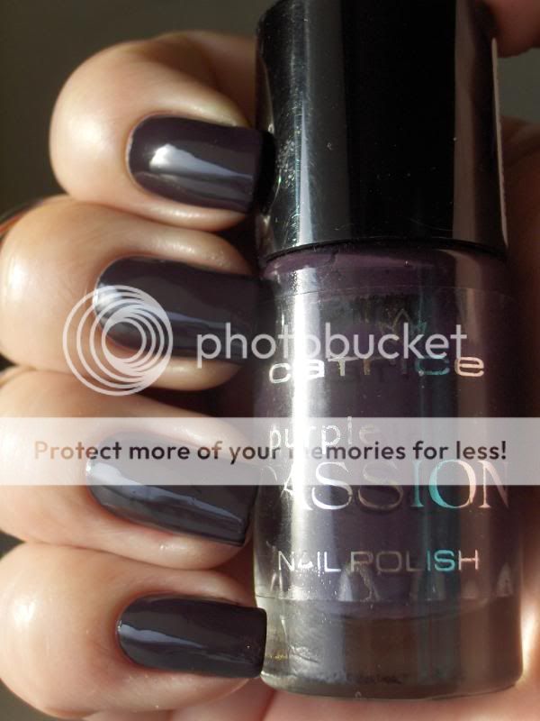
Deep Purple doet haar naam eer aan. In het schemerdonker lijkt ze zwart maar in het licht is het een heel dieppaarse rokerige vampy paars.

English: Deep Purple lives up to it's name. In low light she looks black but in the light she is a very deep purple smokey vampy purple.


De andere reden dat ik deze voor de dag heb gehaald is omdat Thess me wees op Diamond Cosmetics Crushed Velvet, een soortgelijke rokerige donkerpaars, die ze wel wat voor mij vond. Helaas heb ik die nog niet anders had ik een vergelijking gedaan maar ze had wel gelijk, ik houd van dit soort kleuren!

The other reason I dug this one up is because Thess pointed out Diamond Cosmetics Crushed Velvet, a similar smokey dark purple, which she thought was right up my alley.
Unfortunately I don't have that one yet otherwise I would have done a comparison but she was right, I love these kinds of colours!


Bedankt voor het kijken!

English: Thanks for looking!

Below the Waves Their Voice is Song, Above the Waves It Sounds So Wrong!


Day 107

No more nerd nails!! (at least for a while) I'm sure some of you are relieved!! :-P I guess this post COULD be considered nerdy, if not only the title, since it's a Harry Potter reference to the merpeople. Anyway... Ever since I bought Hard Candy Break Up, I've totally thought it looked like fish scales, so naturally, last night, when I decided to do a mermaid theme, I HAD to use it, and I have to say, even though there's only a bit here and there, it looks like the light is reflecting off of the scales!


I used:

Thumb:

Sally Hansen Envy Frost (got at Dollar Tree- can't find a link to purchase any online!!) :( as a base, with Hard Candy Break Up over it, http://www.artofbeauty.com/scrpt/scr.dll/Item?Item=1869&brand=2&d=Zoya_Nail_Polish_|_Suvi applied with Konad Plate m57 for the scale lines, Urban Outfitters Matte Nude 3 for the belly, and Zoya Dea for the belly button. Zoya Envy was used for the waist. :)

Index:

Sally Hansen Funky Frost (another Dollar Tree purchase- and no online link to be found) as a base, Hard Candy Break Up over it, then with Sinful Colors What's Your Name sponged on the tips and a bit on the sides. For the scales, I used China Glaze DV8 applied with Konad Plate m57. Next, I used Urban Outfitters Matte Nude 3 for the belly, Zoya Dea for the belly button, and China Glaze Metallic Muse for the waist, which was also outlined with China Glaze Liquid Leather.

Middle:

Zoya Juno as a base with Zoya Savita matte sponged on the tip and sides, and Hard Candy Break Up on top of that. For the scales, I applied Zoya Pippa with Konad Plate m57. Next, I used Urban Outfitters Matte Nude 3 for the belly, Zoya Dea for the belly button, and OPI Parlez Vous OPI? for the waist, outlined in China Glaze Liquid Leather.

Ring:

MAC Phosphor as a base, with Urban Outfitters Orange 2 sponged on the tip and sides, and Hard Candy Break Up over that. For the scales, I mixed China Glaze Salsa and Urban Outfitters Orange 2 on Konad Plate m57. Next, I used Urban Outfitters Matte Nude 3 for the belly, Zoya Dea for the belly button, and Urban Outfitters Orange 2 outlined in China Glaze Salsa for the waist.

Pinky:

Zoya Jo as a base, with American Apparel Mount Royal sponged on the tip and sides, and Hard Candy Break Up over that. Next, I used Urban Outfitters Matte Nude 3 for the belly, Zoya Dea for the belly button, for the scales, I used China Glaze Millennium applied with Konad Plate m57, then used American Apparel Mount Royal for the waist, with China Glaze Liquid Leather for the lines.

Everything was topped off with 2 coats of Seche Vite top coat. :)
Wednesday, 27 January 2010

Muddy Green!

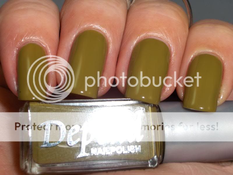
Dit is Depend #172, een van de lakjes die ik bij mijn swap met Anna gekregen heb. Depend is een merk dat exclusief in Zweden verkocht wordt. Qua opzet is het volgens mij vergelijkbaar met merken als Essence en Catrice. Een kleine standaard collectie maar wel regelmatig limited edition collecties.
Als ik me niet vergis is dit er een uit de herfstcollectie.

English: This is Depend #172, one of the polishes I got in my swap with Anna. Depend is a brand that is exclusive to Sweden. I think the concept is simmilar to brands like Essence and Catrice. A small core collection but regular limited edition collection.
This one is from the fall collection if I'm not mistaken.


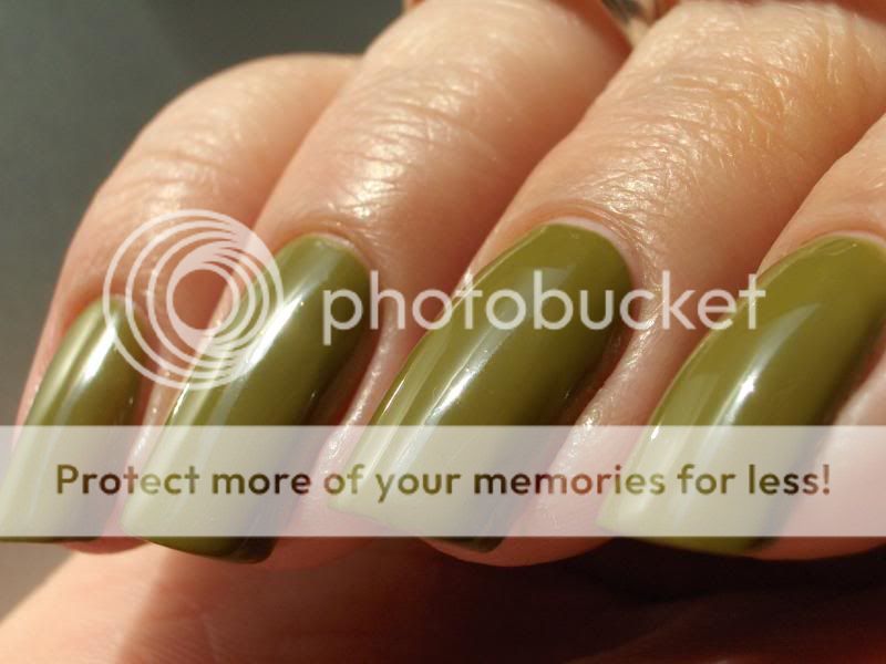
Ze doet me erg denken aan Illamasqua Hectic maar is volgens mij iets meer olijfgroen en wat donkerder.

English: She reminds me of Illamasqua Hectic but I think this one is a bit more olive green and just a bit darker.


Ik had drie laagjes nodig om het dekkend te krijgen maar dat is normaal voor mij omdat ik dunne laagjes doe.

English: She took three coats to be opaque but that is quite normal for me because I do thin coats.


Ik ben er heel blij mee! Blubbergroen, wat kan ik nog meer wensen?

English: I'm very happy with it! Blubber green, what more can a girl wish for?

New nails and ring

This is what i came up yesterday . I really love love love the colors and the design, especially how it is on the ring, however it looks for me, like i need longer nails to really pull it off.
I ll keep the ring and do this design again, on longer nails


H&M - My Favorite Jeans


Hii everyone! Today I'm wearing something by a brand I really love and it's not even a nail polish brand. It's H&M! They always manage to come up with nice fashionable colors for a reasonable price. The formula is pretty decent too.

Recently I bought a lot of their colors, *whoops*, but this one I've already had for a while. It's called My Favorite Jeans. I'd say the color is steelblue and it contains a lot of silver and turquoise shimmer, pretty!

I really like the sparrrklyness it possesses even though it's not a glitter. IMO, the color is a bit too light, this looks nothing like my own pair of favorite jeans :-D. Overall, I think it's a pretty color, but I'm not in love!

Oops, I've got to run! Thanks for stopping by and take care :-).

WARNING!

This is a warning to all of my clients: I just went a little crazy buying new nail art stuff. It may be even harder to choose what you want on your nails at your next appointment but don't worry, they will be super cool!
On these nails I used glitter from sparklesnailproducts.com.

I created little 3d acrylic flowers all over these nails.

This is a mix of clear glitter I created that I named "Brandy" after a super cool client of mine!

All Systems Go!


Day 106

Another Apple-inspired mani today- this one is for you old school Mac enthusiasts! (Yes, I know that it's the Finder icon, too, but it was originally the MAC OS logo... 8.1 baby!!) Yay for iPad!! :)


I used Essie Sag Harbor as a base, which I got on clearance at Ulta for $3, and I'm loving it, I think it'll get used lots in the future, it's just such a pretty color!!! For the other half of the logo, I used China Glaze Secret Peri-wink-le, for the black lines, I used China Glaze Liquid Leather and for the dark blue lines, I used American Apparel Mount Royal, which is a perfect darker version of China Glaze Secret Peri-wink-le. :-P I topped it off with two coats of Seche Vite top coat to get that new computer shine? :-P

Are you excited about the new iPad? Awesometacular.

A little pink and champagne

2 sets of acrylic sculpture extension.


Pink glitter, crystals all around the french line, baby pink ribbons. SWEET!


A popular design among the girls. Extract from Nail Max.


Love this pic! See the thickness and the C curves. Shiok.


Nails for the petite! She's petite and requested to have the wordings painted on her nails. :D


Champagne and light pink roses. Square nails, but client requested to have the edges more rounded. :)


Pretty pretty.

A little pink and champagne

2 sets of acrylic sculpture extension.


Pink glitter, crystals all around the french line, baby pink ribbons. SWEET!


A popular design among the girls. Extract from Nail Max.


Love this pic! See the thickness and the C curves. Shiok.


Nails for the petite! She's petite and requested to have the wordings painted on her nails. :D


Champagne and light pink roses. Square nails, but client requested to have the edges more rounded. :)


Pretty pretty.

New Collection: Catrice Nude Sensation

Ik zag deze vanmorgen en ik kon ze niet laten liggen omdat ik geen enkele nude nagellak bezit.
Ik moet zeggen dat ik een beetje teleurgesteld ben door deze collectie. Catrice heeft normaal gesproken aardig goede nagellakken maar deze waren veel te doorzichtig en streperig.

English: I saw these this morning and I had to pick them up because I don't own any nude polishes.
I must say I was a bit dissapointed by this collection. Catrice usually has some pretty good polishes but there were way to sheer and streaky.


01 Nude Cream. Een melkwitte jelly. Ik heb vier laagjes gedaan en er zijn nog steeds kale plekken maar ik weiger meer dan vier laagjes te lakken van welke lak dan ook.

English: 01 Nude Cream. A milky white jelly. I did four coats and I still have bald spots but I refuse to do more than 4 coats with any polish.


02 Soft Coral. Een doorzichtige babyroze. Ik vind de kleur wel mooi ondanks dat het niet iets is dat ik normaal gesproken draag. Ook nu had ik weer vier laagjes nodig en ze zou nog wel een of twee laagjes kunnen gebruiken.

English: 02 Soft Coral. A sheer baby pink. I like the colour on this one even though it's not something I would normally wear. Again I needed four coats and it could have used one or two more to cover streaks and bald spots.


03 Coral Pink. Dit is inderdaad een koraalroze! Ik weet niet wie besloten heeft dat koraal een goede nude zou zijn maar als iets op mijn lichaam deze kleur had zou ik me ernstig zorgen maken... Eerlijk gezegd vind ik deze echt afschuwelijk bij mijn huidskleur.
Deze had drie laagjes nodig en was wat makkelijker te lakken dan de andere twee. Misschien omdat ze meer pigment heeft?

English: 03 Coral Pink. Oh it's coral alright! I don't know who decided coral would make a good nude but I would be seriously concerned if anything on my body had this colour... Honestly I think this one looks hideous on me.
This is three coats and this one applied a lot better. Maybe this has more pigment?


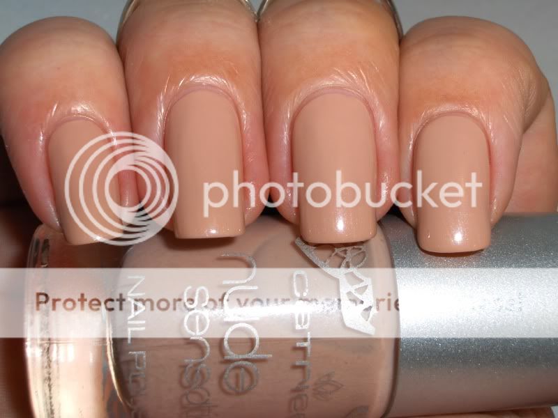
04 Nude Beige. De naam zegt het al. Ze hebben het beste voor het laatst bewaard bij deze collectie. Deze vind ik erg mooi! Dit is drie laagjes. De applicatie was wederom een stuk beter dan de eerste twee. Mooi gelijkmatige laagjes en niet zo streperig.

Ik had wel een vergelijking willen doen met al deze lakjes maar ik heb alleen iets in mijn collectie dat een beetje op Nude Beige lijkt.

English: 04 Nude Beige. The name says it all. They saved the best for last with this collection. I really like this one! This is three coats. Application was a lot better than the first two. Nice even coats with minimal streaking.

I would have done a comparison of all colours in this collection if I had any but I only had something simmilar to Nude Beige in my collection.


Nude Beige op wijsvinger en ringvinger, Orly Country Club Khaki op middelvinger en pink.
Vergeleken met Nude Beige lijkt de Orly echt een grijs terwijl dat helemaal niet het geval is als je haar op zichzelf ziet.

English: Nude Beige on index and ring finger, Orly Country Club Khaki on middle finger and pinky.
Compared to Nude Beige the Orly looks positively grey which isn't the case at all if you see it on it's own.

Samenvattend: deze kleuren zijn niets voor mij en ik ben blij dat ik daar achter ben gekomen met nagellak van €1,99 in plaats van Essies van €14,-. Ach, ik kan ze altijd nog frankenen.

Bovendien is het best raar dat ze een kleur als koraalroze er wél in stoppen maar dat er geen nude voor donkere mensen in zit. Niemand is koraalroze Catrice! Maar meer dan de helft van deze wereld heeft een andere kleur dan deze lichte kleuren.
Dus ja, baggercollectie.

English: All in all, these colours are not for me and I'm glad I found that out with €1,99 polishes instead of €14,- Essies. I guess I could always franken the lot.

To top that off it's pretty strange that they do add a colour like coral but not a nude for dark-skinned people. Nobody's skin is coral Catrice!
But more than half the population of this world has a different colour that these pasty polishes.
So yeah, sucky collection.